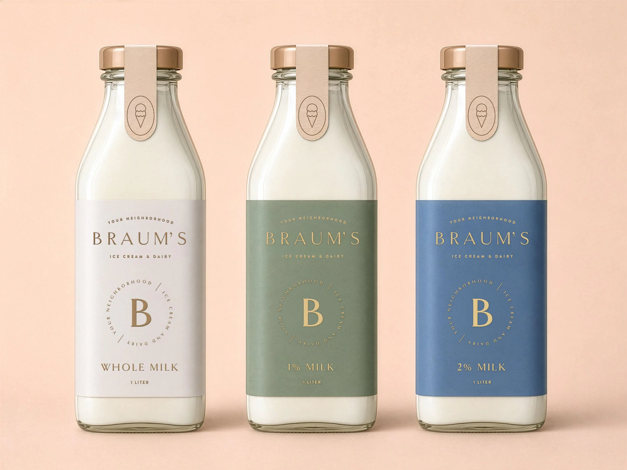
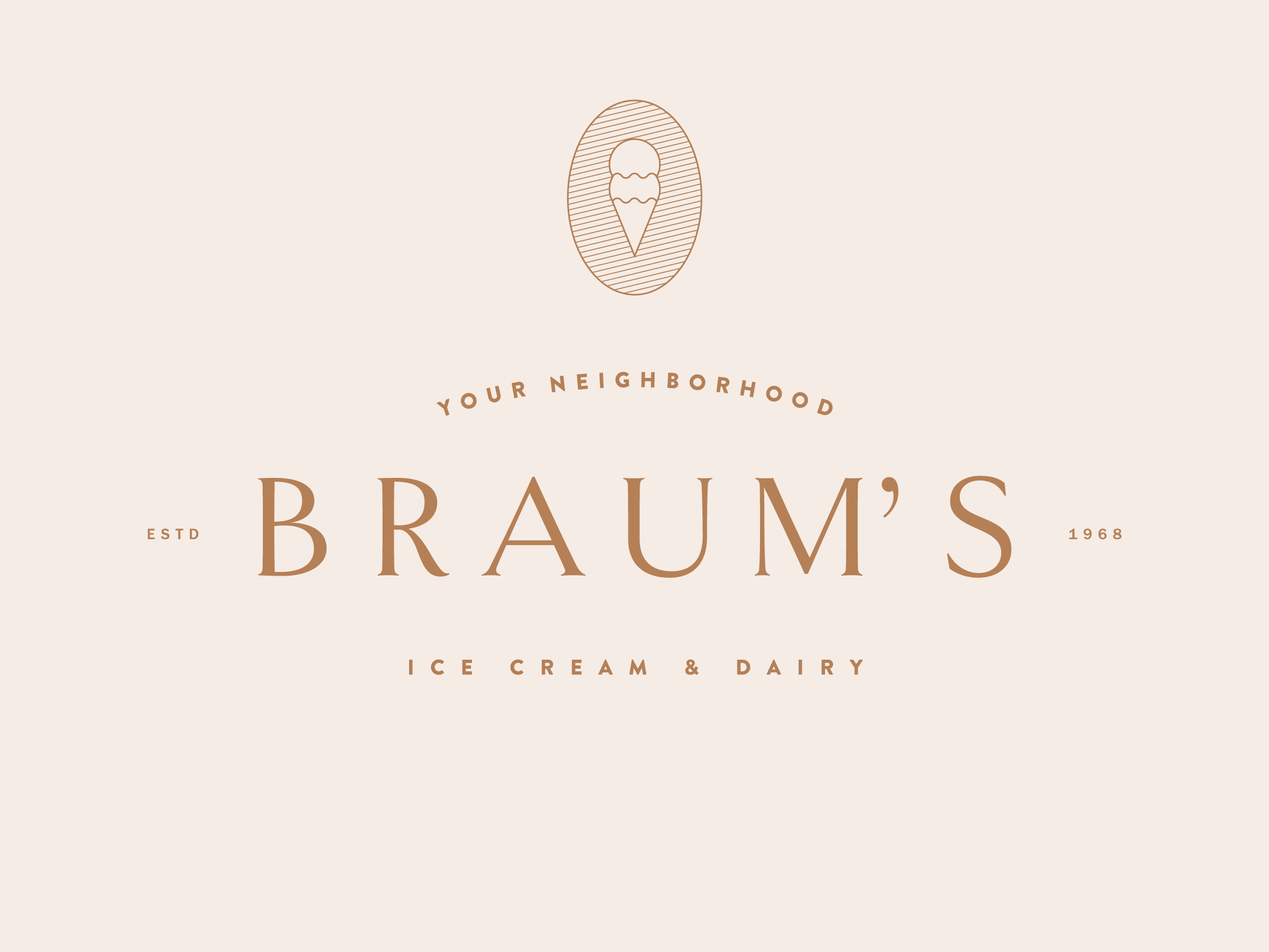
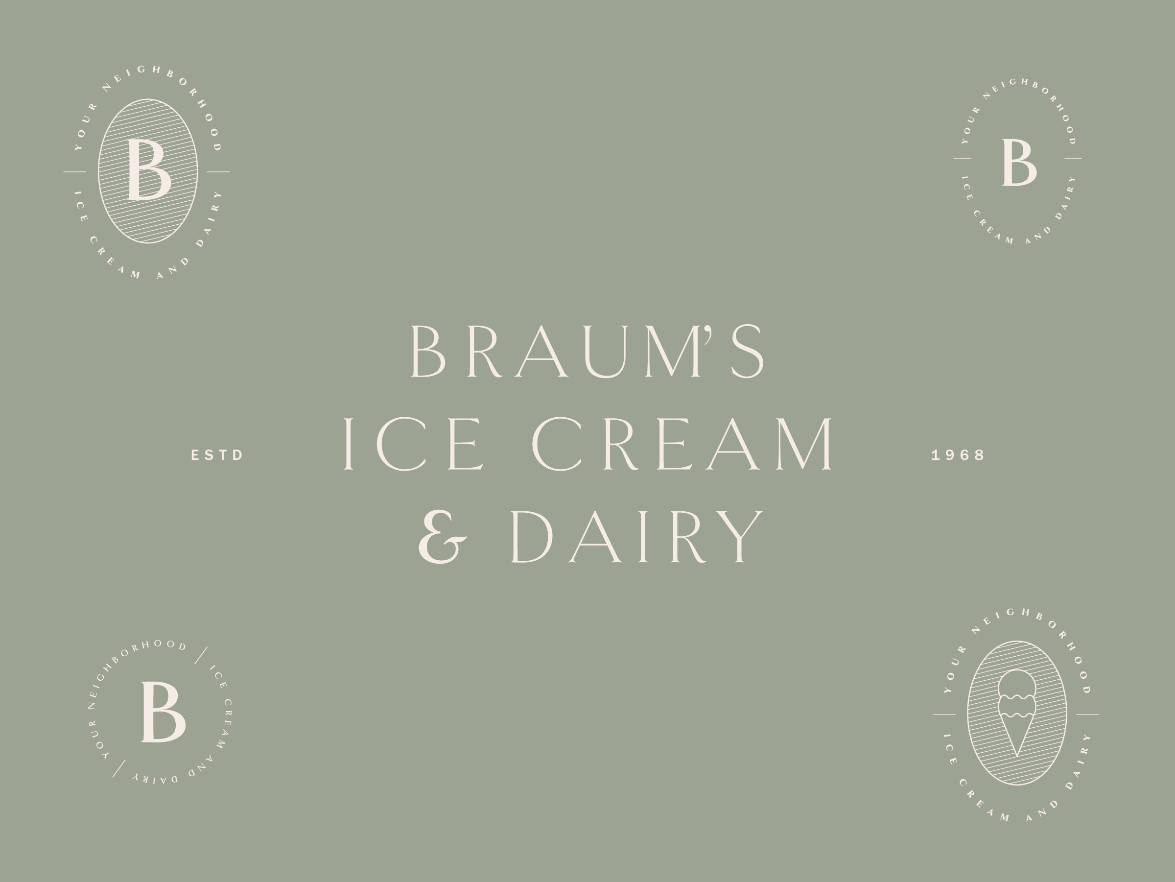
Braum’s identity reimagined
Project
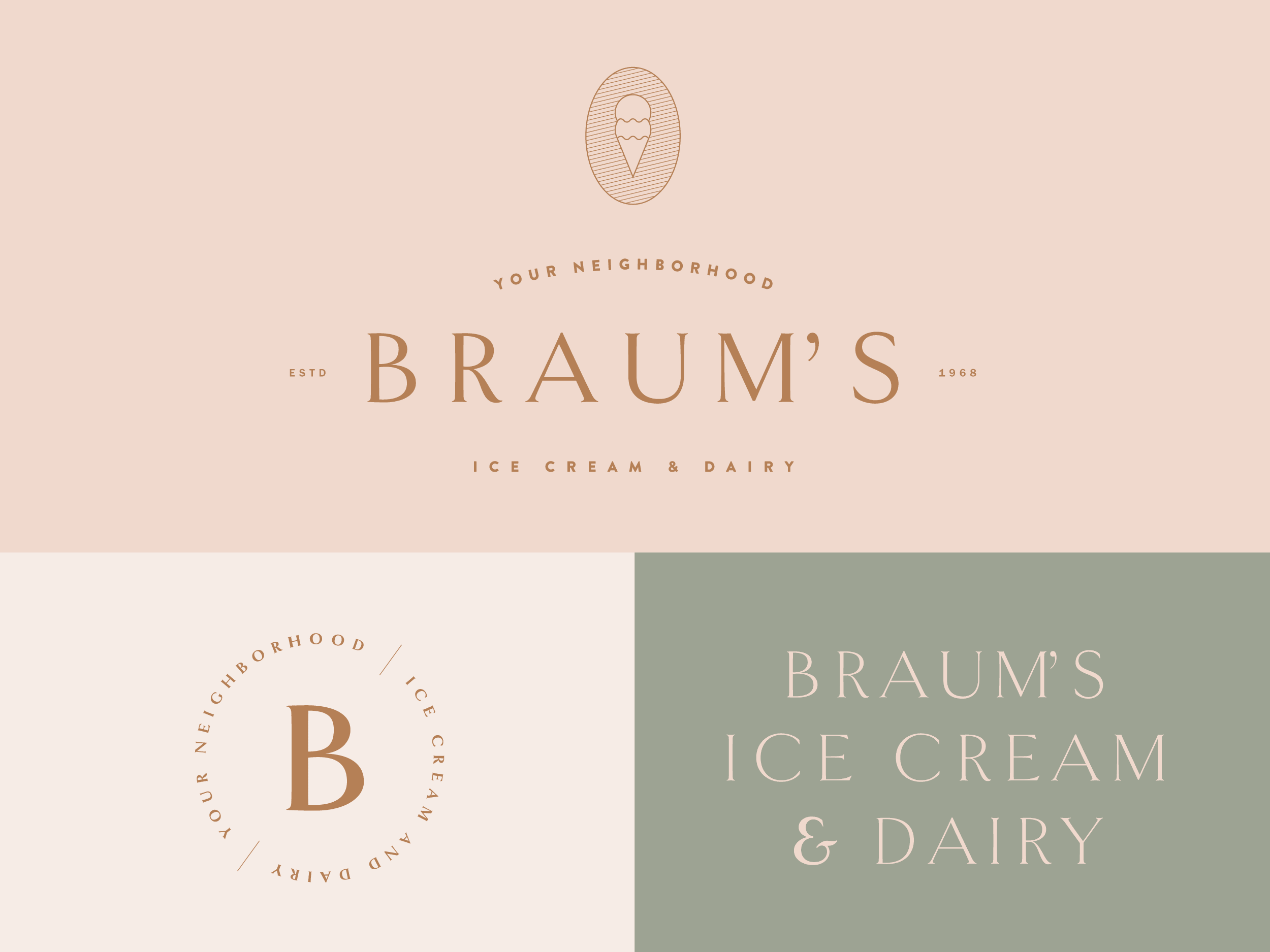
Braum's: an Oklahoma-based restaurant chain and dairy with crinkly-cut fries, delicious banana splits, and notoriously poor branding. This was a just-for-fun project reimagining Braum's as a hipster's dream.
Braum’s is an Oklahoma institution: family-owned, home to its own dairy farms, known for its crinkly fries, and banana splits. This was a just-for-fun project reimagining Braum's as a hipster's dream. Imagining what it could look like as a small, bespoke, specialty brand rather than a regional fast-food chain; a brand system worthy of the deliciousness that it represents.
Client: Self-Initiated Project
Industry: Food
Services Provided: Brand Evolution, Identity