Diamond Conference Identity
Project
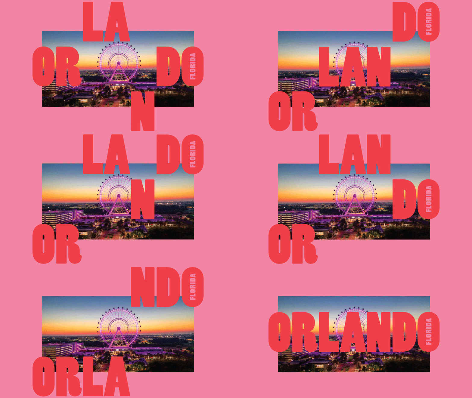
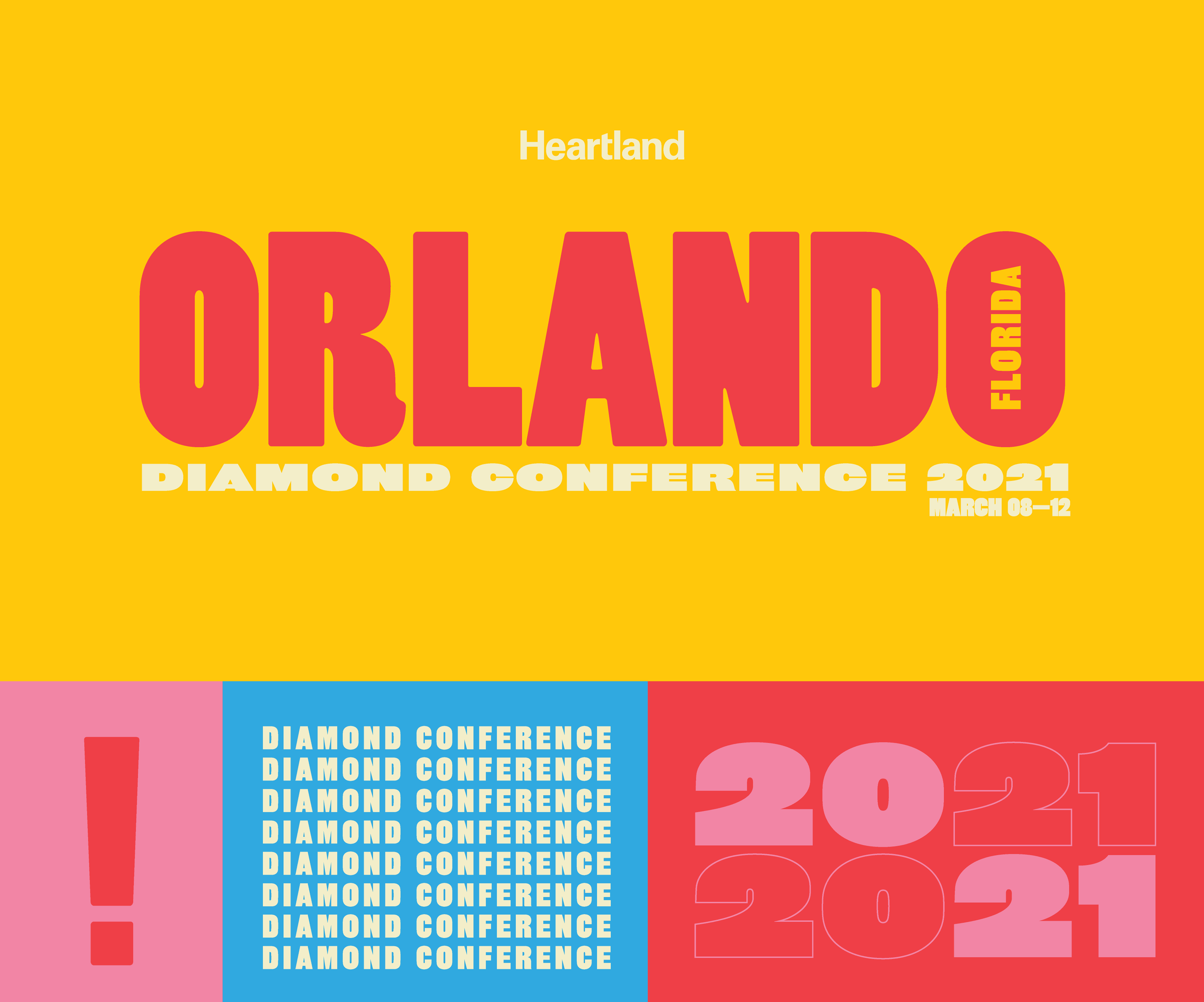
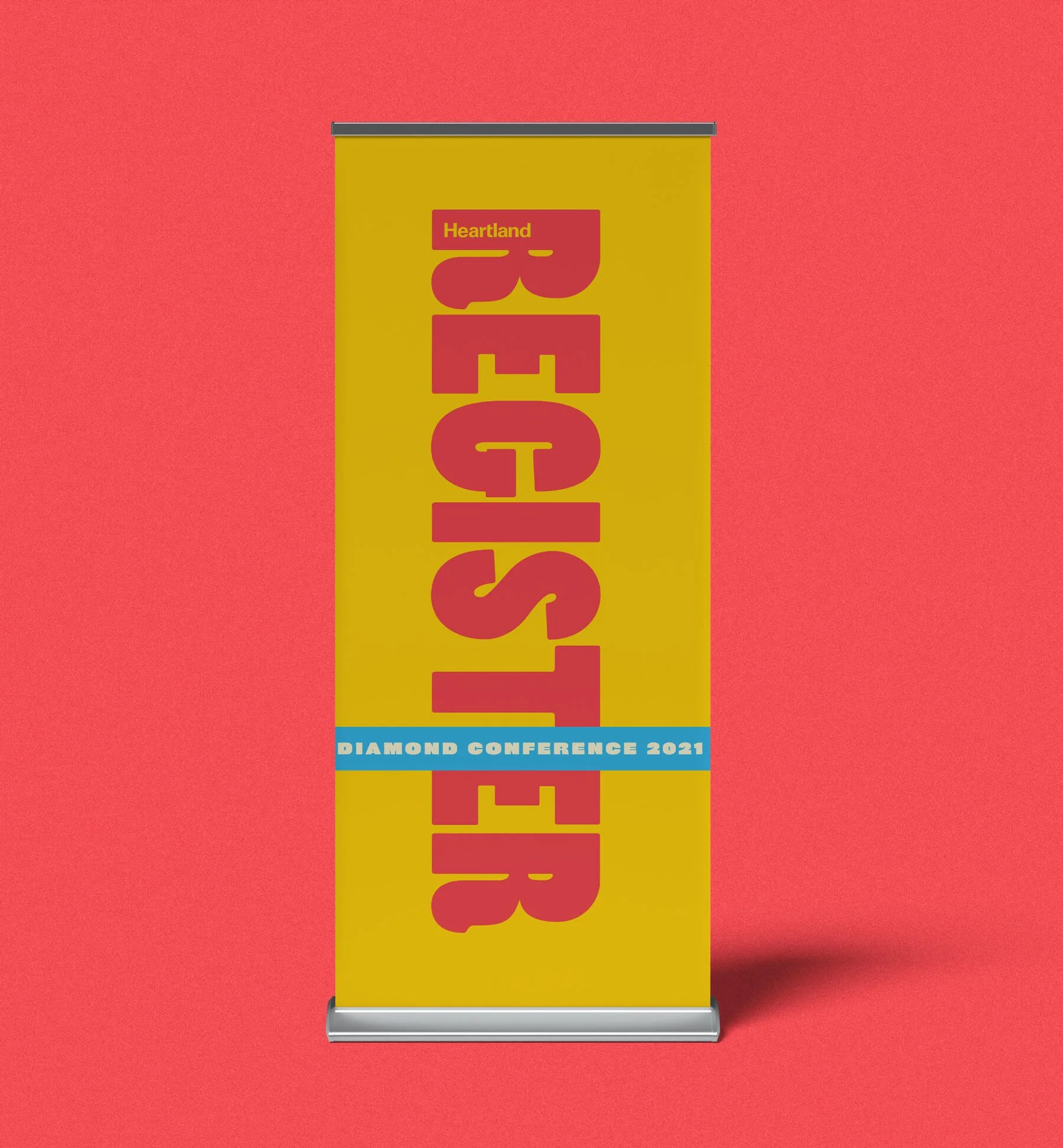
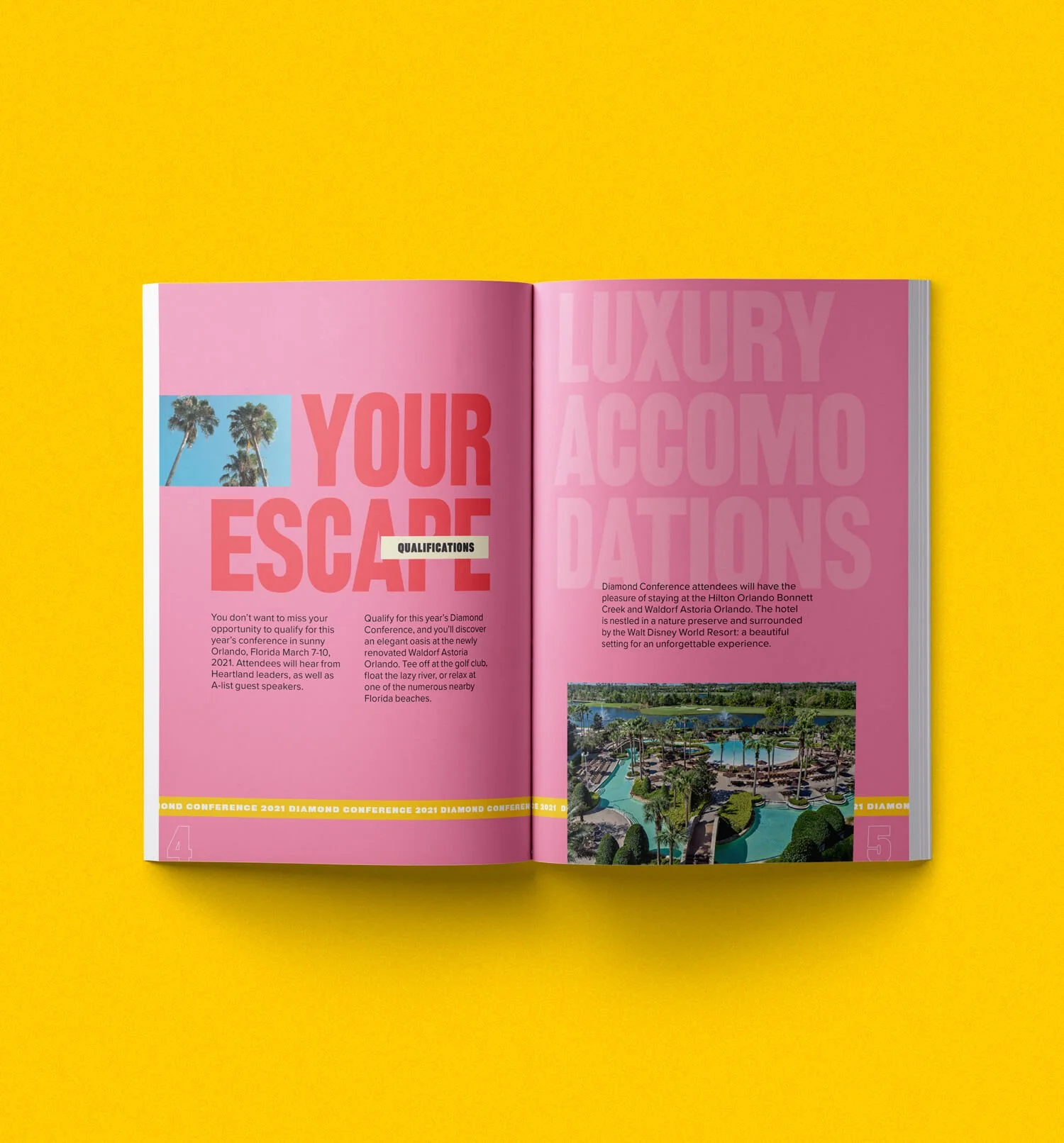
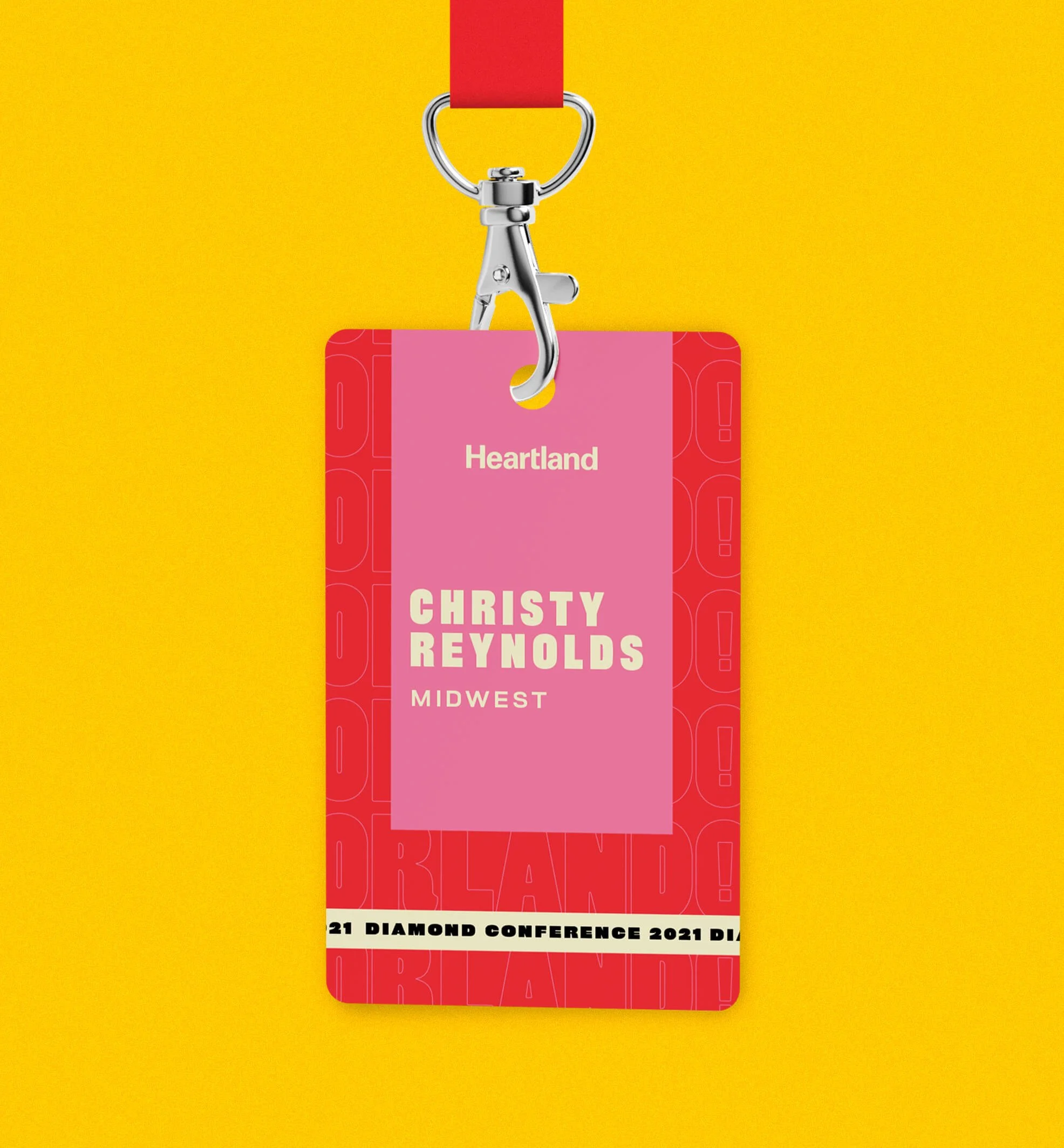
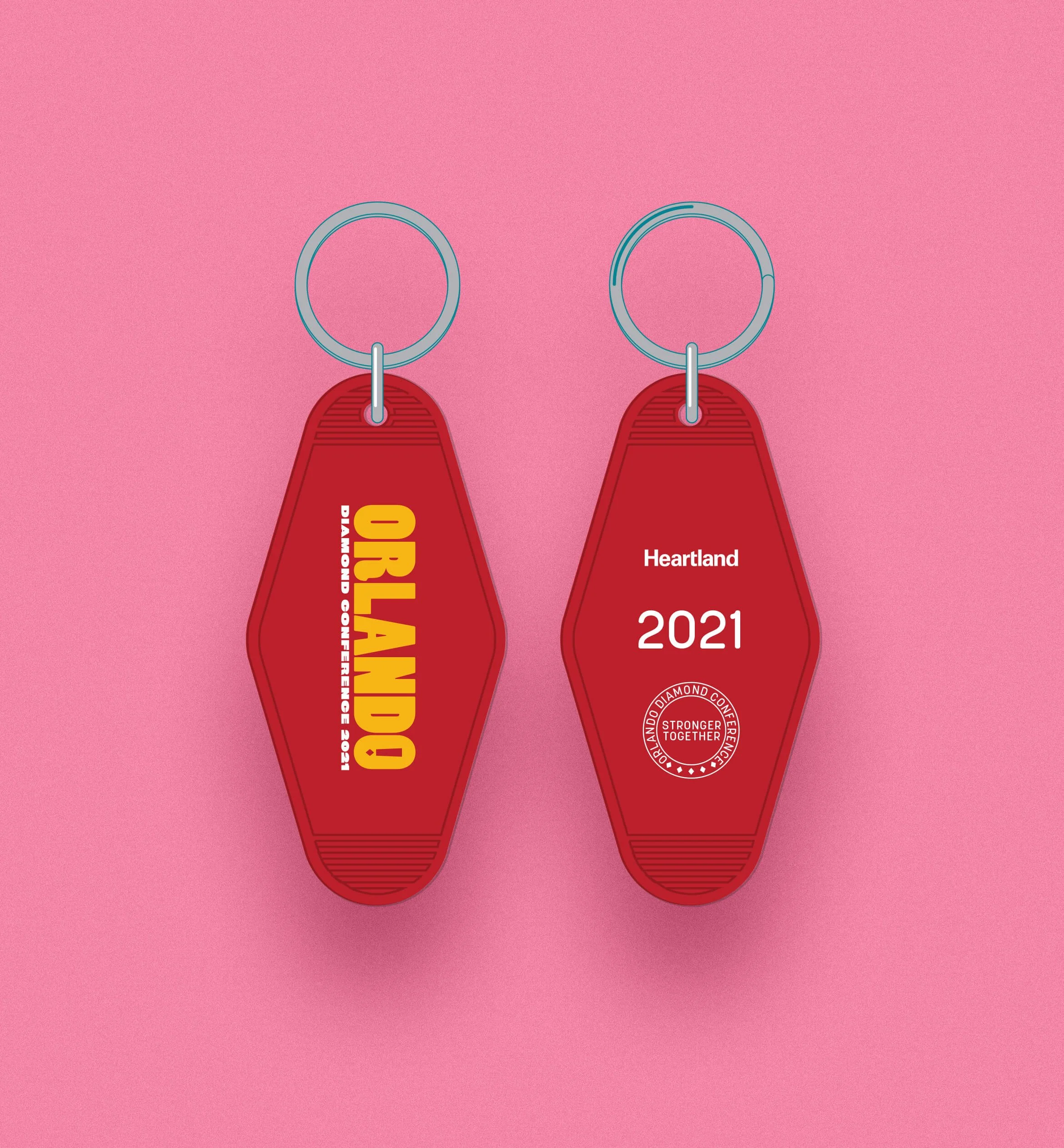
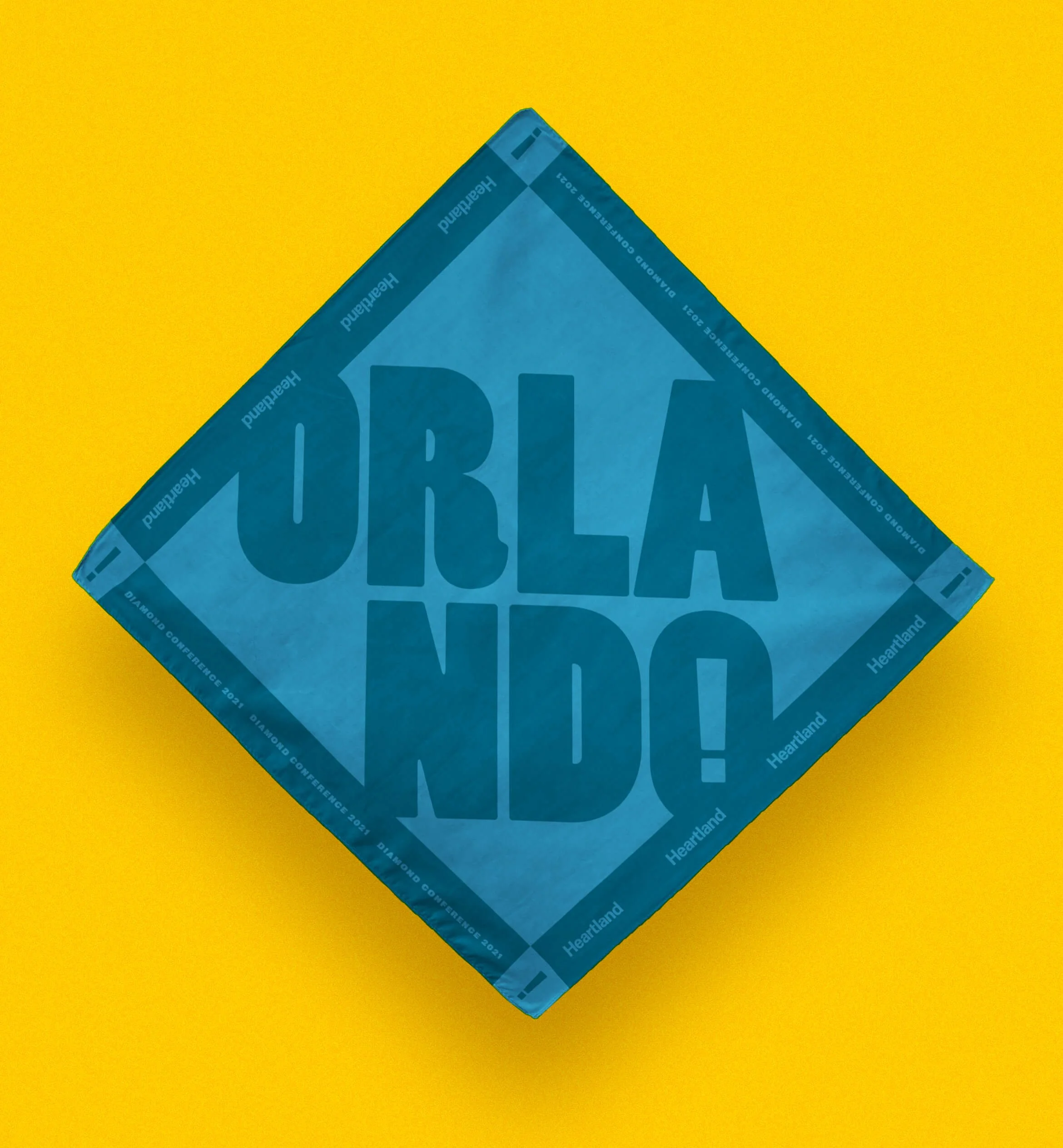
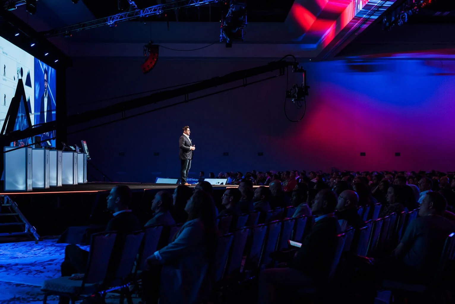
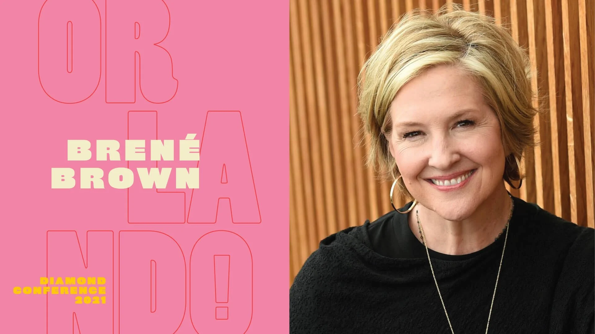
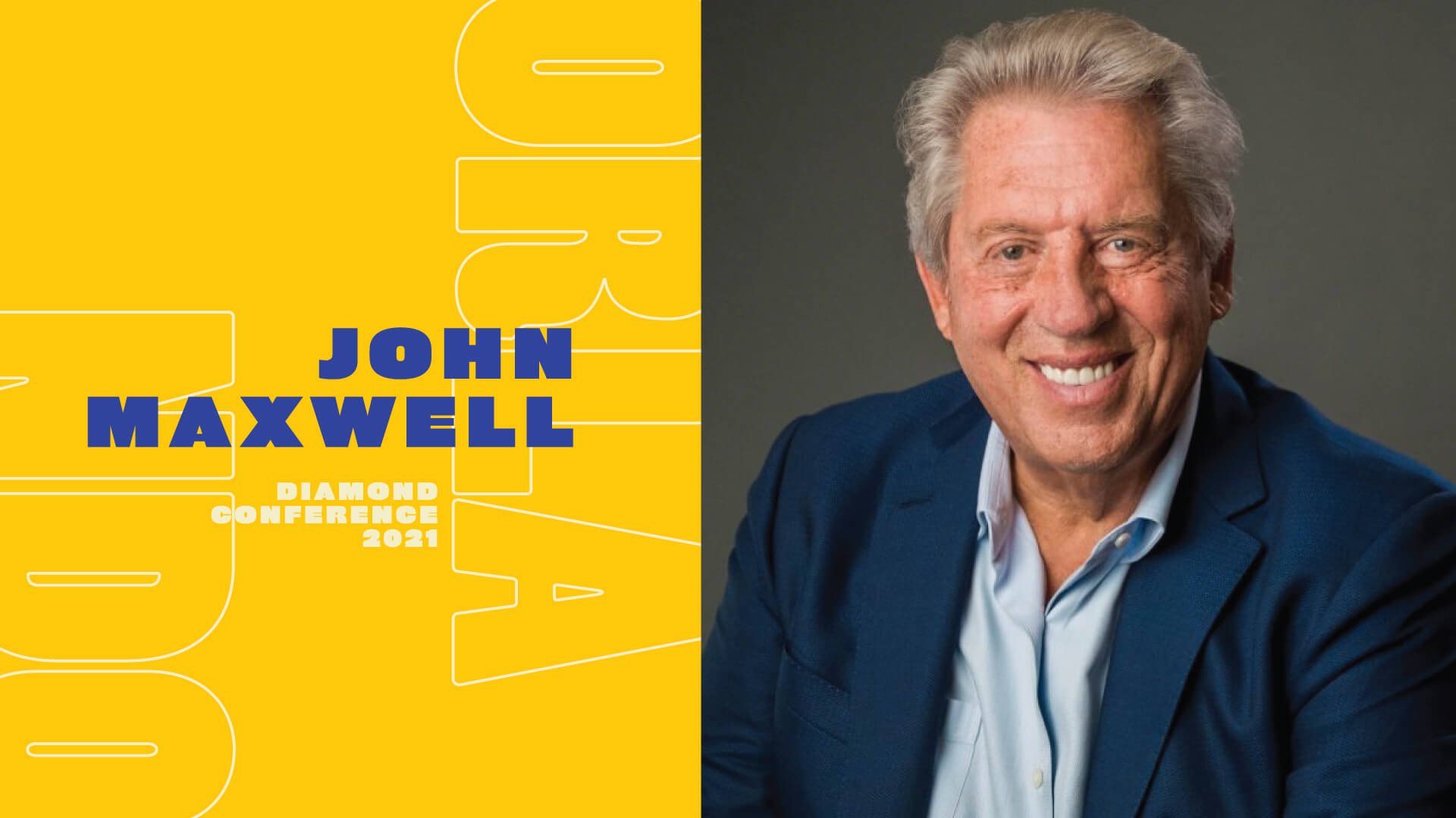
Bold and distinctly Orlando — without borrowing from the city’s most famous resident — was the brief for this year’s identity for Heartland’s Diamond Conference. Part keynote, part TED Talk, the Diamond Conference is the company’s biggest internal event of the year, reserved for the salespeople and employees who earn their way there. The goal was an identity system flexible enough to carry a full year of touchpoints — swag, hype videos, mailers, presentations, and the event itself — while staying consistent without ever feeling identical.
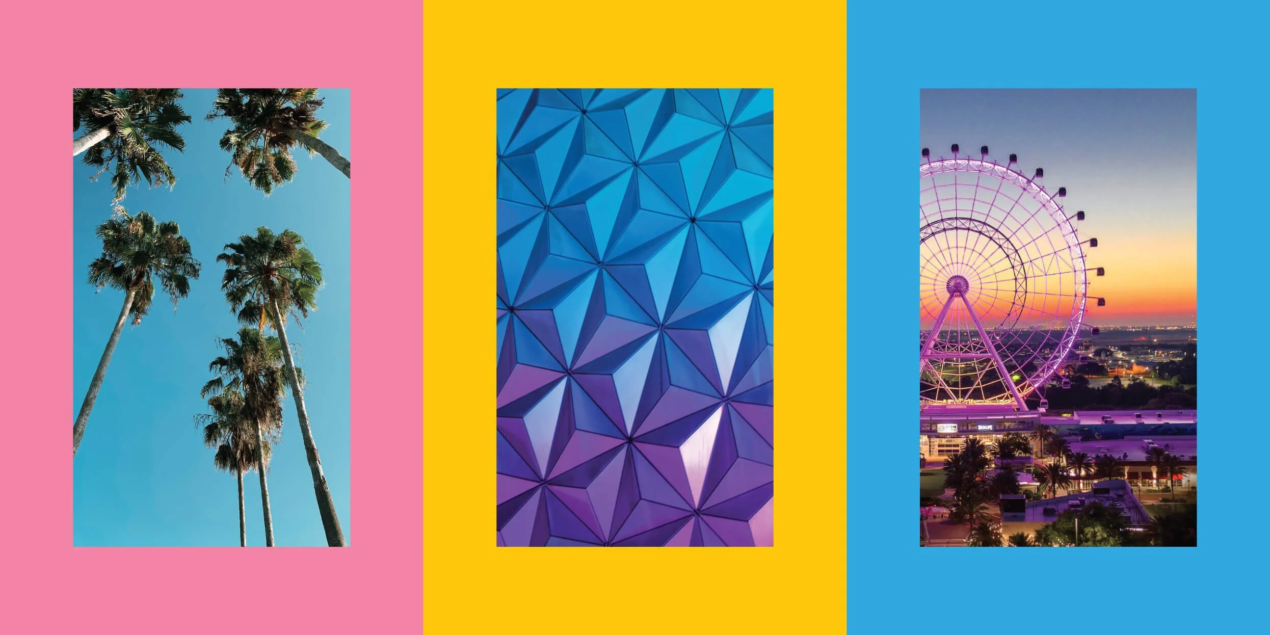
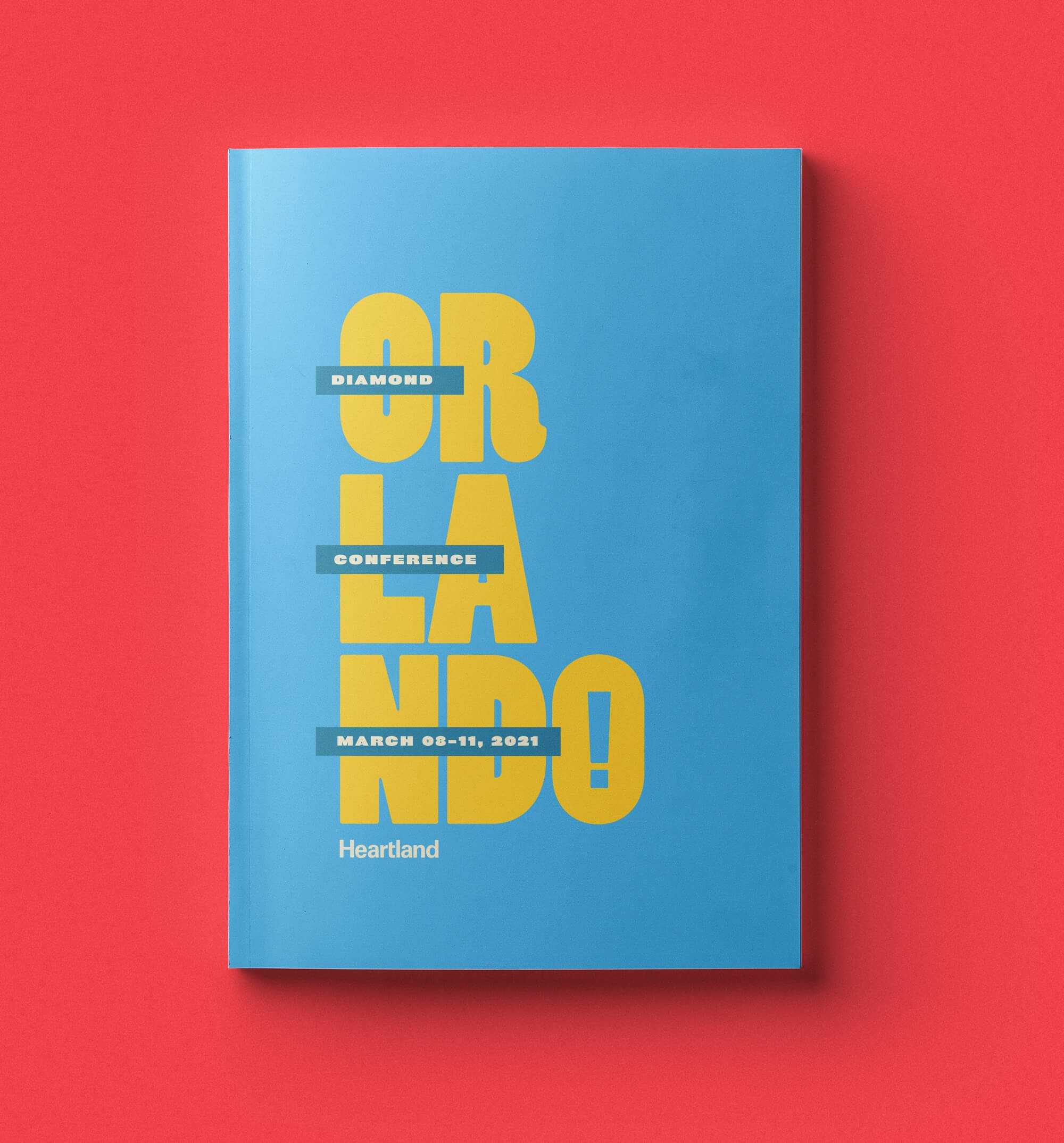
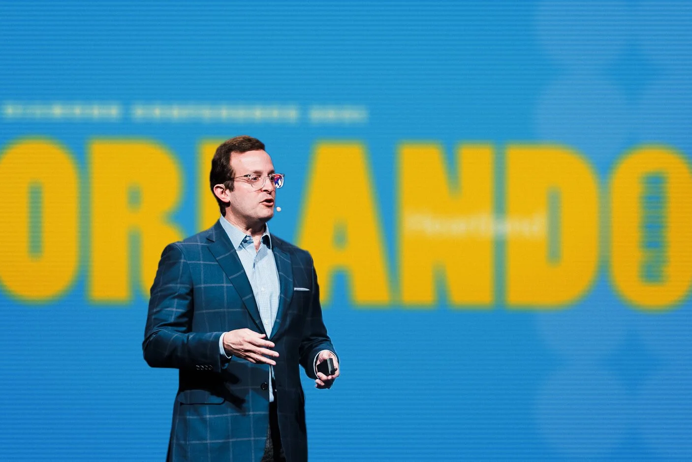
Drawing on Orlando’s tropical color alongside art deco and mid-century influences, I built the system around bold, playful type and bright color rather than literal iconography or illustration.
The final direction was, unexpectedly, the boldest concept I pitched — a typeface I loved for its extreme contrast between thick and thin strokes. I rarely have a favorite when presenting to a client. Rarer still, they picked it too.
Client: Heartland Payment Systems
Industry: Financial Technology
Role: Brand Strategy, Identity, Brand Guidelines, Print, Web Campaign, Environmental Design

Orlando diamond conference
2021
Orlando diamond conference 2021