In Between Identity & Publication Design
Process
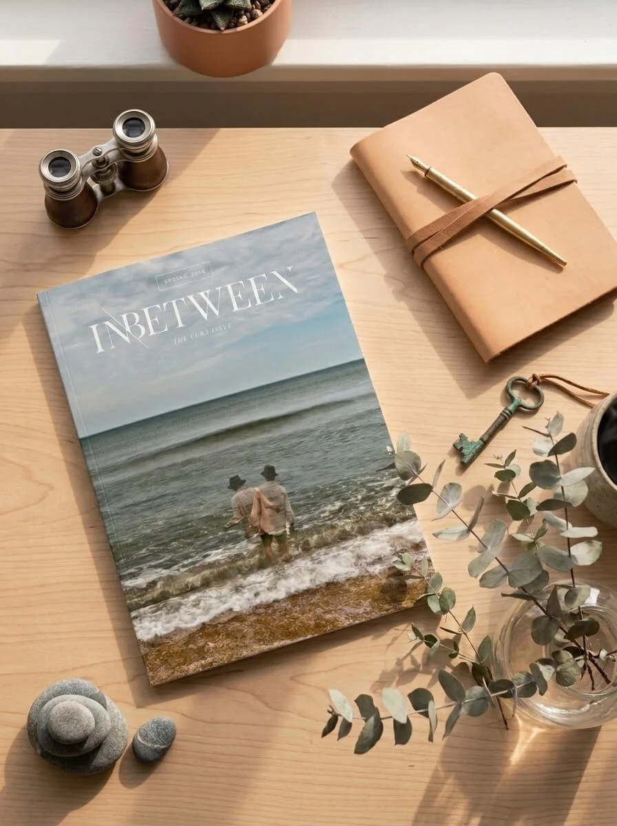
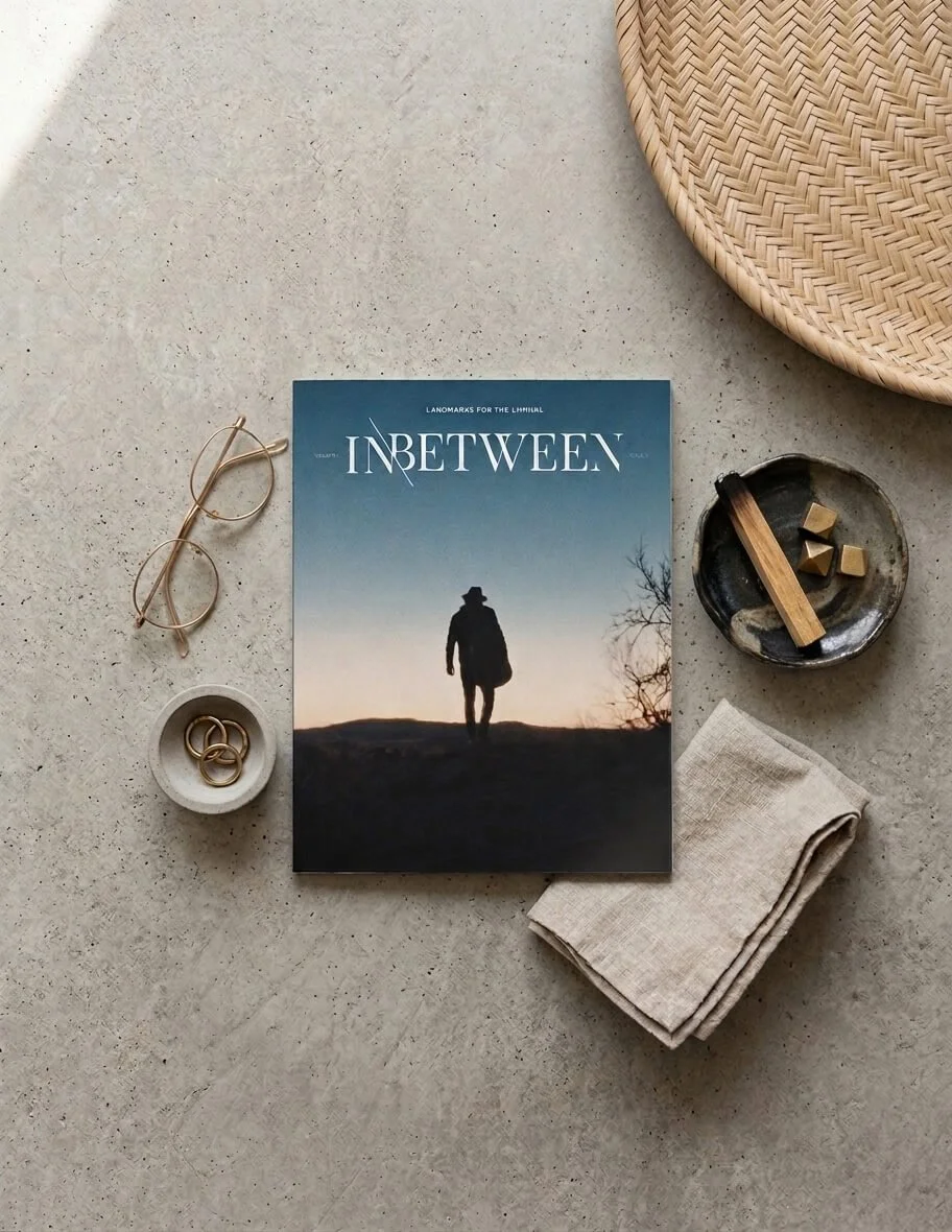
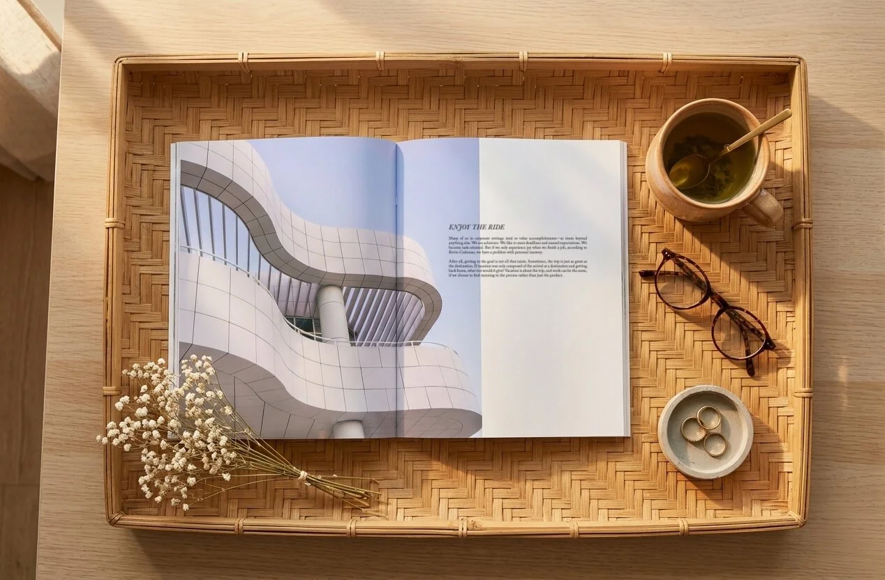
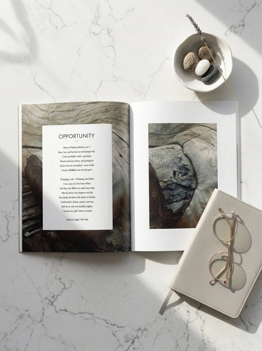
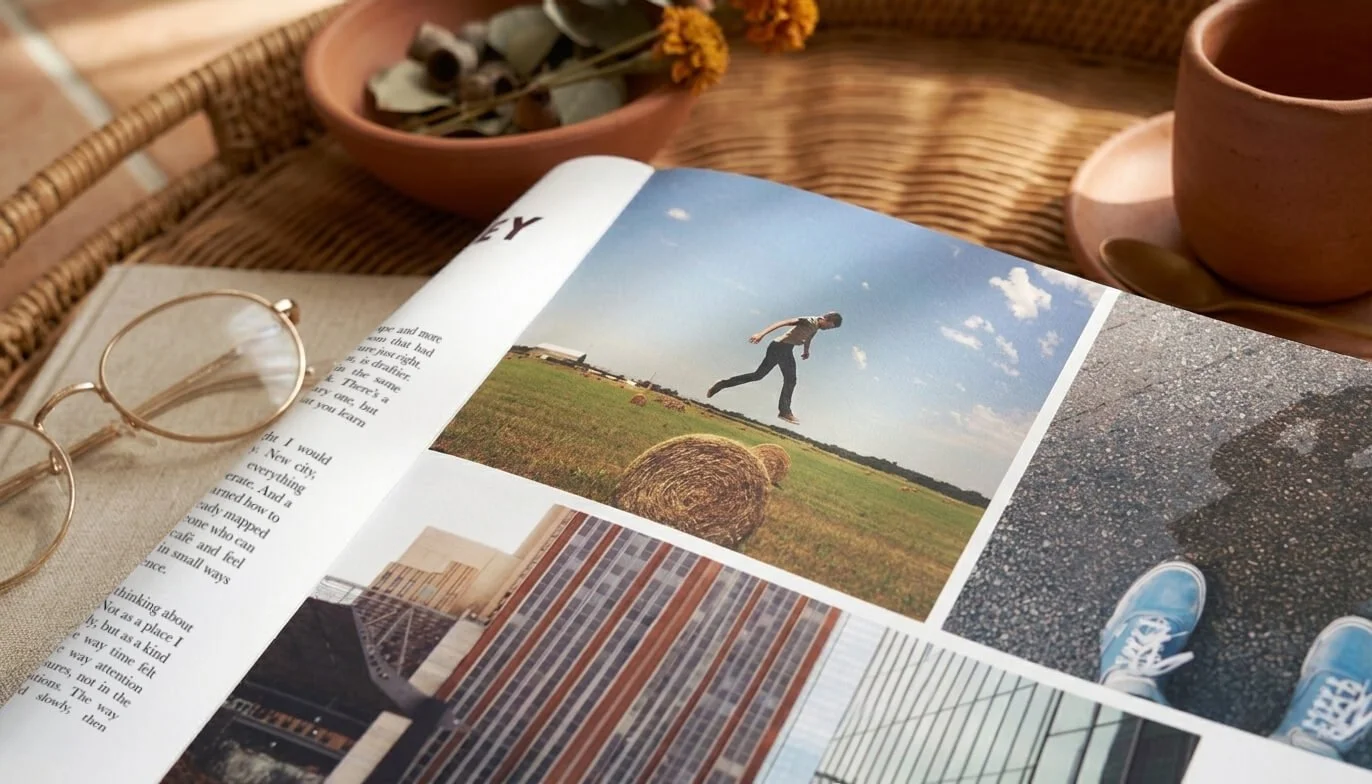
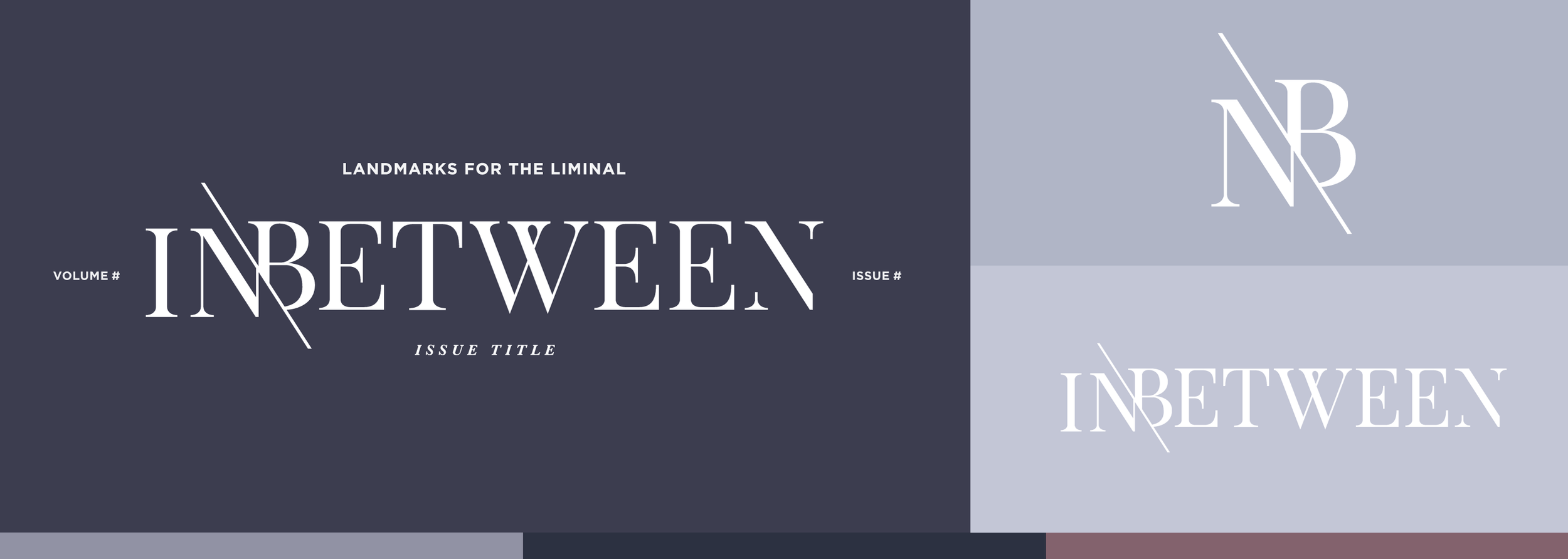
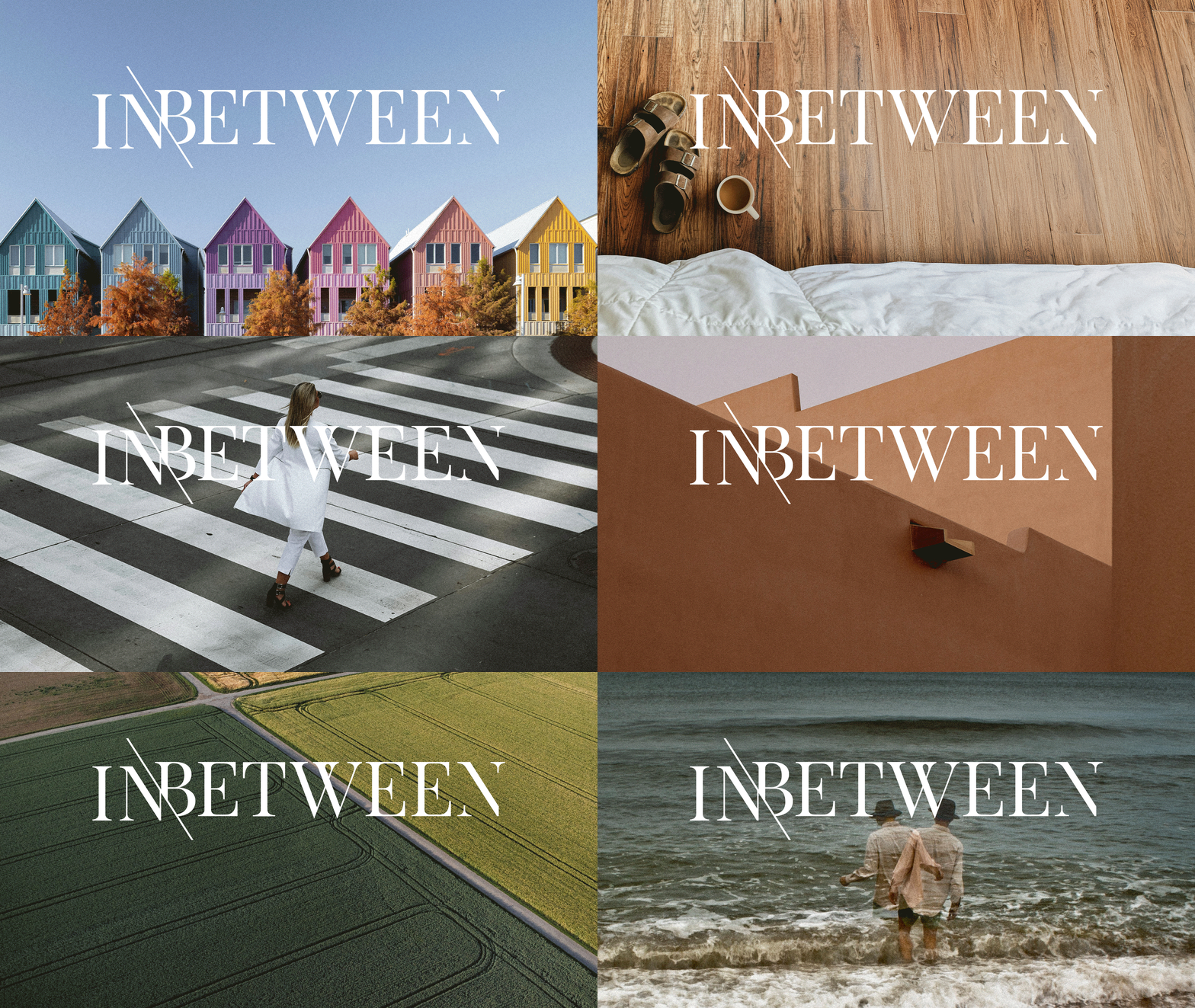
In Between is a print publication turned movement from a volunteer team of Oklahoma creatives (myself included). Through crafted writing, stunning photography, and exclusive visual art, In Between spotlights the commonplace and uncomfortable without pretense or false humility. I developed the full identity from the ground up, including brand strategy, art direction, and a complete print system built to hold poetry, short fiction, and photography with equal weight. The masthead itself reflects the concept directly — its wordmark broken and offset, refusing to sit neatly on a single plane. Every layout decision that followed was built to give space-forward, contemplative content room to breathe.
Client: In Between
Industry: Publication
Services Provided: Brand Strategy, Art Direction, Identity, Print